Graham Read – Look Back


Graham-Read-Soapbox-Press-Article-Interview-Look-Back-ImpactReport

Graham Read

Twitter / InstagramEmail: readgraham@rocketmail.com

Graham Read, an all round Graphic Designer from Somerset, currently in Bristol. Well, when we say all round Graphic Design it’s only the projects he feels most passionate about and believes in. Graduating with us in 2012 from Winchester School of Art in Graphic Arts: Advertising, he’s now working on designing and communicating for charities and social enterprises. Before we say more we’ll hand in over to the chap himself… 

Hello, I’m Graham, a designer and charity communications chap previously nestled among the dreaming spires of Oxford, now based in the lovely city of Bristol. I have predominantly worked with charities and social enterprises, having started up RAG while at Winchester School of Art, moving on to a couple of internships at charities after graduating: Student Hubs, and Oxfam.

Graham-Read-Soapbox-Press-Article-Interview-Look-Back-ImpactReportsv4

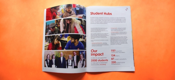
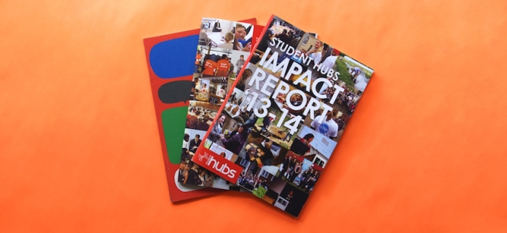
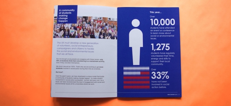
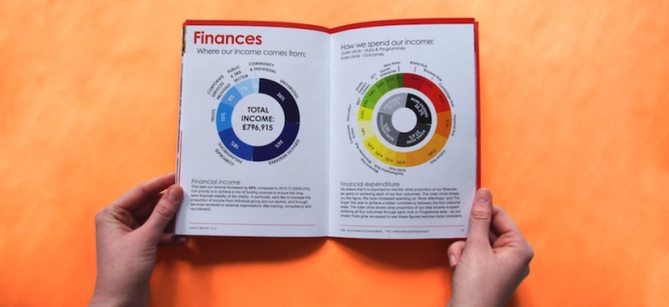
After a bit of interning, freelancing, and persistence, I was awarded a permanent position at Student Hubs, an organisation that supports students to volunteer in their communities – tutoring struggling schoolchildren, activities with lonely elderly people, and lots more. One of my first projects was to design the charity’s annual review, detailing the organisation’s achievements and impact for the preceding year. Part legal requirement, part promotional brochure combining data, successes and areas for improvement.

Graham-Read-Soapbox-Press-Article-Interview-Look-Back-ImpactReportsv5

My first annual review for Student Hubs, for the year 2011-12, needed to be a friendly but self-promotional A5 booklet, aiming to increase the charity’s funding and engagement. I don’t have a particular visual style, so I started by establishing the target audience, reviewing the charity’s brand guidelines, previous reports and marketing materials. As the only designer, and having not designed a text heavy booklet before, I downloaded a digital mountain of annual reviews, watched some youtube tutorials and started sketching layouts.

Graham-Read-Soapbox-Press-Article-Interview-Look-Back-ImpactReportsv6

Since the first, I have designed another two printed annual reviews for Student Hubs, with the most recent, an online report, requiring learning a load of code to make it responsive and look reasonable. Looking back over each report and seeing how my skills have improved is very satisfying – I’ve still got a lot to learn, but have definitely improved! Codecademy is great for an introduction to coding, and online tutorials have never let me down.

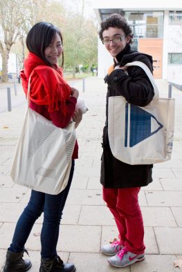
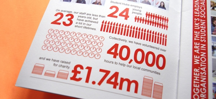
Alongside the layout for each review, I took a lot of the photos, designed infographics and icons. Working independently has certainly taught me a little about a lot of things. As well as annual reviews, I’ve also produced policy reports and an A4 sales brochure for charity and university sector audiences. I’ve found that more formal documents can be just as interesting to design, and using different page sizes presents new opportunities (so much space! [Nerd.]). It has been great to hear feedback from sector professionals and a huge increase in university engagement as a result of materials I’ve designed.

Graham-Read-Soapbox-Press-Article-Interview-Look-Back-ImpactReportsv7

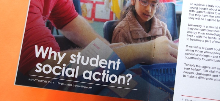
Throughout all the printed reports I have produced, it has been great to see narrative, imagery, statistics and case studies collide to create (hopefully) engaging, informative, audience-tailored documents. Being given the responsibility and space to do this independently has really helped me to feel more comfortable taking on new, big, interesting projects.
Cheeky segue, I’m currently available for new, big, small, medium, and interesting projects, so drop me a line if you want to chat about working together. And have a look at my website to see some of my portfolio.

Graham-Read-Soapbox-Press-Article-Interview-Look-Back-Salesp1

Grace Holliday – Look Back

Grace Holliday

Website / Twitter / Instagram: @GRACEGHOLLIDAY / E: graceholliday@gmail.com

Pattern maker from London – she’s got mad skills. We’re taking a ‘look back’ at three of the graduates from 2012, Winchester School of Art. First up? Well, we’ll let Grace introduce herself…


Black Pen Archive
Black Pen Archive

As an illustrator / mark-maker my practice explores detailed drawing techniques to create hand-made works of either archival or narrative quality.

With a particular emphasis on process and pens, the way that I make is intense, often playing with a tension between chance and perseverance to construct marks that leave behind a physical trace of the tools application. Visual rhythms, sense of place and ephemeral existence are all regular themes found within my personal, as well as commercial projects.

Bound Shapes
Bound Shapes

Such ‘human’ influences can be found within my Black Pen Archive, an extensive project of material enquiry that is still very much on-going. The project came about whilst I was studying for a Masters Degree in Visual Communication at the Royal College of Art. I began to develop my own creative ethos that: beauty emerges from basic materials controlled by complicated hands and found myself exposing a previously hidden sketchbook practice for the first time – in many ways this was the point at which the state of process became the outcome.

The Black Pen project marked a definite turning point in my approach to contemporary illustration and now leads me to question further more conceptual forms of contemporary communication.

Red Fur Camouflage
Red Fur Camouflage

Predominantly, the patterned surfaces or form-based drawings of my collections are made for modern print, textiles and installation. However, I also manipulate ready-made / found objects such as vintage books and antique furniture’s. A project entitled ‘Bound Shapes’ created crossovers with existing layout content and overlaid random ‘decoration’. Again, this project came about almost by accident as I experimented with new sketchbook possibilities and sought to overcome the dreaded intimidation of the white page. Each page of the historical book chosen features a different shape or pattern dictated by the text format and photographic reference – intern a new identity was made.

I like this concept of almost ‘burying’ materials and identities when making. Hiding certain elements and accentuating others creates an invitation for the viewer to speculate and a journey to trace. The Red Fur drawing that I made represents a type of familiar, yet abstract camouflage. It requires a second and third glance to really decipher what is being illustrated – intertwined cat fur. More so than with other examples in my portfolio, this piece creates an equal balance between mark-making and form – traditional structure meets emerging direction.

Remnants
Remnants


Lastly, and in accumulation of some of these different approaches, I come to the ‘Remnants’ project. This project was influenced by the lost architectures and bygone glories of Victorian London. I wanted to combine my adoration of traditional handmade craft (for which the Victorians were experts) with a type of visual commentary that highlighted a breakdown of decorative substance. The digital / hand-drawn collage that became the poster piece for this project not only summarises my making process for this brief, but on a much wider scale also symbolises my general approach to making as a visual conversation between technical disciplines and mixed-media techniques: abstraction, figurative, pattern and graphic versions of design.


Artistic expression; or how I visualised a very personal experience.

ED: Christina Neill-Griffin is a photographer who explores the relationship between memory and photography. We were drawn in by her subtle use of colour and composition and just had to find out more…

________________________

Written by Christina Neill-Griffin

My passion for photography began when I was recovering from complex illnesses, which for more than ten years left me with very little functioning memory. One day, being driven to an appointment, I stared out the window, watching the spring leaves against a blue sky, as if it were the first time I had ever seen such beauty; I knew I wanted to capture it, and share it.

At times I struggled with simple things, in particular, language, imagery was naturally important. My family showed me photo albums, and told me stories during my recovery, I was lucky enough to regain much which had seemed lost. The experience was one thing, but how to begin to make art about it?

Everyone understands the world around them through experience, but it is memory that teaches us. As adults the closest we come to that feeling, is in travelling to a different country, and not knowing the word for something. Describing something by it’s purpose is a very long-winded way of communicating, we really take for granted, that we can use the name of something to convey all the information we need about an object to another person. The alternative to language which is generally global, is the visual language.

For me photography is the perfect medium with which to explore memory, having a strong history of documenting ‘the everyday’ as photographic art, and traditionally acting as a ‘witness’ being a tool for the Police, legal profession and media. The recent advances in digital photographic manipulation has meant that it’s position of truth has been called into question, society as a whole is now distrustful of it’s authenticity, skeptical of the reality contained in the photograph. This questioning is central to my approach; expressing the surreal reality of everyday life.

12788958_969816089721048_1280195450_o

Losing all conceivable knowledge means that misunderstandings are inevitable, but the intense or humorous ones stayed with me. Confining the images to a domestic nature, partly because my clearest memories were recovering at home, also there is a clarity which comes from these ubiquitous items. I chose to express those moments, by recreating them with an increased discomfort, where reality is significant and yet somehow subverted. My aim was to express the relationship of objects and thoughts; to show that reality isn’t always what it seems, reminiscent of Freud’s theories of the subconscious.

There were plenty of struggles; sweat, tears and 7 inches of hair went into create the images. I never realised it would take nine weeks to source second hand Lego, or that I’d look at 15 eggcups to decide which had the best shape for the image. All these little considerations went into every image, even those I discarded early on as not fitting into the series. I chose to work on a large format film camera, I needed the images to be real, for when they are called into question as being untruthful. It was quickly obvious that the images that worked most successfully were those that elicited a physical response from the viewer.

12789826_969815873054403_817762588_o

However, I had two variations of the story that I wanted to express, the first Morpheus, I have explored. The other is the whirlwind nature of life when you don’t have a sense of who you are, or what is happening. Deimos, is more process driven, I love the range photography gives us – Deimos is not visible through any other medium, the techniques of layering images and slow exposures are unique and unpredictable. I used that to capture the ephemeral feeling of the fear and confusion, of not knowing or understanding the world around me. The distortion of reality, the whirlwind of time and it’s occasional abruptness, which I experienced; whilst maintaining an edge of the softness, beauty and excitement with which children see the world, because they are still innocent and open-minded. I tried to produce contrasting elements of eeriness, serenity and otherworldliness.

The planet Mars has two moons, Phobos and Deimos,  which were named after the sons of the Greek god Mars, the god of war, during my illness my mind was at war with my body.  Phobos was the god of a fear of war, hence phobia, and Deimos was the god of flight and terror, which connected with my interpretation of the rush and confusion of it all.

The chose to use the name Deimos for two reasons, firstly my consideration that my experience is as close to an out-of-this-world feeling, in the sense that I could not understand the world around me, and secondly, even as a child I was passionate about the stars.

I always envisaged Deimos as a book, as the text was very important to me. Before I became ill and lost my memory, I loved language and poetry, the ability to play with words and create something beautiful, however speech became an ever frustrating battle for understanding. I needed to express my autobiographical experience, with enough detachment that I was not overtly melodramatic. I felt poetry was the perfect text for Deimos as it explained in a non linear, descriptive way, allowing room for personal interpretation, poetry is more abstract than a chapter of non-fiction, which reflects the soft abstract nature of the images, and contrasts with the intensity of my personal experience.

12788677_969816473054343_941221612_o

It was actually a scanning accident that influenced the final look for some of the images, but I really loved the way that reflected this idea of an old movie film skipping so that you saw two parts of a picture at the same time. Deimos expresses the disconcerting nature of my condition, trying to explore the speed and confusion of life.

Whilst the projects explore my own experiences, I understand that other brain injuries, and medical conditions can cause similar reactions and frustrations, and that advances in medicine are discovering one of the last unknown depths, the human brain. I have been lucky to witness many people’s reactions to both projects, and I love how many different stories and interpretations people can relate to the projects. I continue to expand the theme of Morpheus, and am creating more images over time to include in the project, but ultimately I am thrilled with the the results of two different interpretations of such a personal experience.

12765669_969816463054344_813179537_o


The transformation of student to tutor


ED: Us here at Soapbox have watched fellow graduate Daniel Hobson on his journey to the other side as a now fully qualified Tutor – Blimey! We just had to ask more…

_______________________________________________________________

Being asked by Soapbox to pen my journey from Graphic Design Student at Winchester School of Art, to Graphic Design lecturer in the far east of China, gave me a chance to reflect on a four-year period full of new: experiences, friends, food, places and challenges.

At this moment I am back from China where the campus has closed for the winter holiday and for the Chinese spring festival. I am sat in the dining room of my parent’s house, spending 9 months out of the country means I have no home of my own in the UK. Drinking a cup of strong coffee, looking out on the coldest day here so far, which is a lot milder than some of the -15c Siberian temperatures we have experienced in Dalian. I begin the start of the journey that has led from being responsible for my own design projects to becoming responsible for the teaching and learning of a cohort of more than 90 second year students.

Winchester is a small and peaceful city, full of history as the old capital of England, with its quaint streets, leafy parks and renowned cathedral – a stark contrast to the mighty size of Dalian, one of the many expanding cities of China. In Winchester, a busy and creative studio of a highly motivated designers surrounded me, where we frequently worked together on our projects late into the evening. I was very fortunate to have been part of this group of young designers as we encouraged, inspired and bounced ideas off of each other. Our studios became a second home as we filled all available white spaces with the colour, shapes and patterns of our creativity. As a student I had my ambitions and dreams to become a designer that created work the world would see, to write new design rules and set new trends.

338219_2727544354882_1112776938_o.jpg

Figure 1 My future wife Katrina and I in Winchester

In the second year this would all change when I met someone whose path I would join; my soul mate, friend for life and partner, Katrina. As Katrina is Chinese to stay together we discovered the complex and sometimes unfair immigration system. To give us more time to tackle the inevitable problem we both studied a Masters together. This pushed our design skills further and questioned our roles as designers in modern society; tackling problems such as designing for Dyscalculic Nursing students, rethinking how to engage the always connected audiences of today and what the future of print will be.

MAotucome.jpg

Figure 2 MA final outcome, Dyscalculic cube

At the end of the Masters we received the opportunity to move to Dalian, China and gain experience as teaching assistants. Following my future wife I took the spontaneous decision to apply, this was the start of an adventure to China.

The selection process was to provide support at the Winchester summer school, this is where I met someone who has become a close friend, colleague and business partner; a French man full of life, Olivier Blanc. In the classroom as a teacher for this first time I spent time talking to the students about their ideas and experiences, Olivier recognized my potential as a supporting and naturally empathetic teacher and recommended me for the role.

For me this was a big step, the day I first left home was the day I packed my suitcase and travelled 5500 miles. Arriving in Dalian, China, I didn’t start my first job as a designer but I completely embraced the role of teaching. As a job teaching in China, each day has different challenges, but most important thing is taking the time to talk to students supporting, encouraging and nurturing their creativity. In my first semester I met and worked with a very experienced tutor from Australia, Stuart Gluth, a friendly, welcoming person with a big heart.  Stuart inspired me, he was comfortable to walk into any classroom and inspire students in the way he delivered design concepts through imaginative workshops that had us all thinking outside the box. He could make what would seem a simple task of cutting and positioning black and white shapes a thoughtful provoking challenge to create the most contrast possible.

Stuart.jpg

Figure 3: Stuart Gluth and I taken on a trip to Beijing. November 2013

To this day I continue to follow Stuart’s philosophy of trying new ways of teaching design. Sometimes this leads to success such as workshops that involved tracing the grid of a magazine and then re-applying the content of the magazine back onto the grid in a new and novel layout. Sometimes trying new methods such as having a 100 students work together to group images based on their keywords leads to chaos and a lot of noise. But this is the art of teaching trying and reflecting, it doesn’t always work but it leads to new ways of working with the students, where classes are new and fresh and not stagnant and dull.

When second semester arrived, it turned out that Stuart was moving back to Australia, leaving his large cowboy boots he always wore, to fill. I was thrown into the deep end, given a cohort of students to be responsible for. For me this was the break I had been looking for, rather than sink I embraced the challenge, I wrote my first brief and planned the teaching based on the learning outcomes. I was fortunate to receive expert guidance and support from the Dalian team to ensure I didn’t sink.

At this point it was the realization that what I teach, how I encourage, how I inspire will have an impact on the future success on this group of next generations of designers in China and beyond, it was this realisation which became part of my dogma to ensure the students receive the skills that they require to be successful in today’s world of design.

IMG_0346.JPG

Figure 4 Students mind mapping a response to a given article

A year later I was given the full role of teaching fellow. No longer a student working on my own project, but instead planning and deciding the direction of the projects a large group of students will undertake and how we can collectively get the most out of their ideas. We have just finished a book project where the students illustrated a poem, as a teacher I judge their success on the diversity of ideas and work they completed. We had concertinas, pop up books, hard back books, fold out pages, cut through, books that where made from an old camera, a triangle book, all kinds of imagery printed onto different papers. It is seeing the final work and it is seeing the students excel, become confident and bold that I enjoy most from this job.

studentoutcomes.jpg

Figure 5 Student artist book designs

I have now completed higher education teacher training where through reflective practice and continuing to try new teaching methods, I have achieved distinction. This has given me the confidence in myself to recognize that what I am doing as a young teacher is having a positive impact on the students.

I am still at heart a graphic designer and through building a network of clients and friends in Dalian I have had many opportunities to apply these skills. Publishing editorial articles in the city magazine ‘Focus on Dalian’, building websites for a client in France, pitching packaging design to a New York drink company and as marketing officer at the university designing informational and promotional posters. This gives me a retreat from the teaching and keeps the design tools sharp. I also get to use those important skills to plan and design student exhibitions and then get those creative hands dirty with some paint and a hammer.

TranpsortOfChina.jpg

Figure 6 Photographic essay ‘Transport of China’ as part of own practice.

One of those differences of being a tutor to a student is the assessment, which becomes the assessment ‘process’. As a student there is the pressure of the hand-in day, the desire to get the best mark possible to succeed in your future career. As a student, the day after hand-in you suddenly find there is little to do, you are set free, your sketchbook has been locked away and it is time to celebrate the end of a year. As a tutor it’s the start of rigorous days of scrutinizing each students portfolio. The assessment has to be a fair process where work is moderated internally and through an external examiner. This moderation process is integral as judging creativity and design can be open to personal bias, this adds to the pressure to ensure you give each student the mark they deserve, you can find yourself debating marks by margins of 1 or 2%.

Student Exhibition.jpg

Figure 7 Students final work exhibition

Unlike a student the assessment becomes more than an individual’s mark, it is the success of the full cohort. As a tutor you reflect critically on the teaching and learning, have I taught the skills the students needed to complete the brief? Was the delivery of teaching suitable for students to assimilate? Have the top students been challenged enough? Was the teaching at the right level?

One similarity in assessment is it can be a measure of success both as a student and as a tutor.

This journey has been a big adventure and life experience for both Katrina and I as we both start our careers.


Painting a Glimpse of Extinction

Finders Keepers

I’ve been on a journey, accompanied by poet Harry Man, to memorialise Britain’s vanishing wildlife. These creatures, along with countless others, are disregarded as we rush about our hectic lives each day in our concrete metropolis. But outside in the natural world which we so heavily depend on for our food, clothing and pretty much everything else, each creature is entwined in an ecosystem more complex than we know. Many are disappearing before we can catalogue and study them, a process critical to learning how to protect them. From microscopic bugs to fungi and algae, to bigger creatures such as birds and mammals, they are all a part of a global issue – a mass extinction, the extent of which is hard to grasp.

'Starry Sky' from 'Finders Keepers' illustration by Sophie Gainsley

‘Starry Sky’ from ‘Finders Keepers’ illustration by Sophie Gainsley
Our capitalist greed-fuelled actions of the past centuries have set in motion what scientists are calling ‘The Sixth Extinction’. Put concisely by New York writer Elizabeth Kolbert, ‘Over the last half-billion years, there have been five mass extinctions, when the diversity of life on earth suddenly and dramatically contracted. Scientists around the world are currently monitoring the sixth extinction, predicted to be the most devastating extinction event since the asteroid impact that wiped out the dinosaurs. This time around, the cataclysm is us.’

It is hard to believe this as we sit comfortably in our built-up cities. But it has been revealed by scientists, that we “have only identified about 10-15 percent, at most, of existing species. Most types of life are unknown, rendering the great dying crisscrossing the globe eerily invisible to human eyes and silent to human ears.” – Tikkun Magazine.

As discussed in The The Ecologist online and OneTreePlanted.org, the main issues which are driving species into extinction, – recent studies calculating that we are losing up to 200 species a day – are mass habitat destruction such as deforestation and pollution. Trees are being burned and logged at a scary rate. 80% of the world forests have already been destroyed and every 2 seconds, an area the size of a football field is destroyed.

d.jpg


Return of the Humpback 

But it is not all doom and gloom. There are countless inspirational projects all around the word and a myriad of success stories. When first observed by mariners, the Humpback whale was named ‘The Merry Whale’. Not so merry is the fact that their curiosity and fearlessness made them easy targets for Whale Hunters. Add to this, their predictable migration routes and what you were left with was a marine massacre. Humpback populations were ravaged across the globe, so much so, that when the International Whaling Commission (IWC) banned commercial whaling of Humpbacks in 1966, there were only 5,000 left. This number may sound like a lot, but it was estimated in a study  that Humpback populations were reduced by up to 90%.

There were only several hundred Humpbacks left in North Atlantic waters, where many traditionally feed on the rich marine ecology during the Spring and Summer. Since then, the Humpback has made an impressive comeback. There are now 80,000 recorded whales worldwide and the species went from being labelled ‘endangered’ in 1988 to being considered a ‘least concern’ as recently as 2008. This is just one of thousands of conservation success stories well worth celebrating.

'Hello World' illustration by Sophie Gainsley

‘Hello World’ illustration by Sophie Gainsley

Our project, Finders Keepers, created by Harry Man, aims to also raise awareness of conservation work taking place across the UK. This includes the protection of habits such as our woodlands and hedgerows which are threatened by the increase of agriculture.


The Toothed Threadwort, the Bastard Balm and the Wormwood Moonshiner 

As I scrolled down the long list of endangered UK species, some of the more imaginative and entertaining names jumped out. Among them, I found the quaint ‘Grizzled Skipper’, the ‘Grayling’ and ‘Bastard Balm’, all imaginative names for different butterfly species.

Meanwhile an unsuspecting algae goes by the name of the ‘Toothed Threadwort’ and a ribbed black beetle, the ‘Wormwood Moonshiner’. Even in the most unlikely of places, the British sense of humour prevails and reminds us of our abundant imagination and creativity. It was these traits and our ability for forethought and planning, which enabled us to survive against the odds and thrive in most environments across Earth until today. There is much hope that these same traits will enable us to undo some of the damage we have caused and turn back the clock, to conserve threatened species. In the words of

David Attenborough, “Our planet is still full of wonders and as we explore we gain not only understanding but power. It’s not just the future of the whale that today lies in our hands, it’s the survival of the natural world on all parts of the living planet. We can now destroy or we can cherish. The choice is ours.”

'The Woods' from 'Finders Keepers' Illustration by Sophie Gainsley

‘The Woods’ from ‘Finders Keepers’ Illustration by Sophie Gainsley


Links

1 http://www.manmadebooks.co.uk/Harry_Man/Home.html

2 http://www.tikkun.org/nextgen/why-extinction-matters-at-least-as-much-as-climate-change

3 http://www.theecologist.org/essays/2986610/extinction_is_forever.html

4 http://onetreeplanted.org/pages/tree-facts?gclid=CjwKEAiA5Ji0BRC5huTCyOTR3wISJACH4Bx4gT9FUwiPbr1Ek-lde_jBgc01zfXx20SLU8uDwy5_QxoCDF_w_wcB

5 http://global.wcs.org/Wildlife/GlobalPrioritySpecies/HumpbackWhale.aspx)

6 http://www.finderskeepers.org.uk/

Images

‘Advice Whale’ Illustration by Sophie Gainsley, Poem by Harry Man, from ‘Finders Keepers’

Written by Sophie Gainsley

Edited by Cheryl Burns

My love of Springsteen and a run in at DIY Cultures

I remember when I was a young child in my parents car and hearing my first Springsteen song. It was The Rising back in 2002, and I had yet to discover the likes of Darkness… and Born to Run. But since then I’ve been a sort of disciple of the history, music and story of Bruce Springsteen and the E Street band, and his early bands such as The Castiles and Steel Mill…

So, last year I took my Springsteen zine to the DIY Cultures fair and I received a

surprising response; I was laughed at. Yes – A lot of people I have contact with day to day find my admiration for The Boss quite intense and slightly strange,  but the people at the DIY Cultures fair seemed to also, and  I just couldn’t understand why until I had a chance to walk around and look at all the Zines available.  This is when I realised that most of the zines present were all either potently feminist, anarchist, queer, or anti-war. These are all causes I truly believe in, but because I am a white, straight, mainstream looking woman who happens to have had a comfortable upbringing attending university, I think I’m not perceived as enough of a ‘misfit’ for my views to be seen as legitimate in the zine world, and neither is Bruce Springsteen.  Despite his past and his message, he is now seen as a mainstream artist; too universal to be the required level of misfit anymore. Since when did not visibly being a misfit make one a misfit?

Shorts: Shakespeare on Mortality

The second in the series of Shakespeare Sundays is Shakespeare on Mortality. Here we see Anna Shaffer ruminate on the fragility of nature and it’s impact on her own mortality. The scene is set with Shaffer speaking out to menacing waves, truly questioning nature itself.

To watch the film click here.


Shakespeare-on-Mortality_Still002-784x328

Shorts: Shakespeare on Love

Today HungerTV are commencing their new series Shakespeare Sunday’s with the release of the first short film in the original series. Shakespeare Sunday’s are a three week venture into Shakespeare’s work which will comprise of a collection of three shorts by film maker Jordan Rossi. These shorts showcase three separate themes amongst Shakespeare’s sonnets which are then displayed in a modernised context. This gives them the unique ability to reach a fresh audience and catapult Shakespeare into the modern world.

Shakespeare on Love, the first short to be released focuses on Shakespeare’s sonnets 29-32 and the key theme of love. The short is shot in black and white and features two main narratives which intertwine between one another. The first is a monologue, spoken by Fady Elsayed (best known for his work in the British film My Brother The Devil). We witness his character brooding over the death of a lover. Interspersed between shots of Elsayed runs the second narrative, a beautiful contemporary dance performed by Samantha Johnson. The piece beautifully moulds with the pace and rhythm of the speech which enables the two narratives to mould as one.

To watch the film and read an interview with Fady Elsayed visit Hunger TV.

shake


Written by Cheryl Burns


Exploring Barcelona

by Sarah Boxall

Before visiting Barcelona I knew very little about it. However, since spending a week there last year, I have now concluded that it is one of my favourite places to visit. My second visit is already booked for later this year!

My guidebook had given me a rough idea of the places to visit, but it didn’t highlight just how creative and full of history Barcelona is. It didn’t note how Barcelona was once within an independent Catalonia or that most people within Barcelona wanted to be independent from Spain once again. I didn’t know that the most spoken language is Catalan, not Spanish.  Nor did I realise how diverse the architecture was between ‘Old’ and ‘New’ Barcelona.

One of the main things I love about Barcelona is the fact that art is everywhere you look. Of course, the most well known of Catalonia’s artists is Gaudi, who designed Sagrada Familia, Park Guell and Casa Batllo to name a few. The quirkiness and sheer impressiveness of the buildings he has created make them a must see for anyone visiting Barcelona. It is definitely worth purchasing your tickets ahead of your visit to save time queuing.

sarah1


The Gothic Quarter, set in the centre of ‘Old’ Barcelona, is the perfect place to spend a lazy afternoon. Whether you are looking for quaint shops, bustling food markets or a picturesque Cathedral, the Gothic Quarter has it all. Make sure to cover up if you are hoping to go inside the Cathedral – they didn’t take too kindly to under-dressed tourists.

One of the key monuments I wanted to visit whilst in Barcelona was Montjuic Castle and it didn’t disappoint. Set at the top of a hill, it boasts some of the best views of Barcelona. Although my walk up to the castle was entirely unintended (the cable cars are genuinely quite hard to find!) it was definitely a beautiful one, full of interesting things to see.

sarah2


The Palau de la Musica Catalana, designed by Lluis Domenech I Montaner, is the most unique concert hall I have visited. With a gorgeous stained-glass skylight, detailed mosaic design on stage and sculptures surrounding you, it is the definition of opulence. The guided tour isn’t too expensive and also treats you to a listen of the huge pipe organ that sits above the stage.

sarah3

Another experience that you will definitely not regret making the time for is a Flamenco Show. The Tablao Flamenco Cordobes was recommended to us and I can see why. The food (you can choose a package that includes a buffet dinner, all inclusive drinks and the show) was gorgeous and the show is something that I will never forget. The intensity of the dancing draws you in and the time quickly disappears. I have already booked to go again when I visit later this year.

If you wanted to book any excursions then one excursion I would definitely recommend is a trip to Montserrat. With beautiful views over the Pyrenees, a Benedictine Abbey and a market selling locally made cheese and other goodies, it was one of the highlights of my trip.

sarah4


If you like wine then I would definitely recommend a trip to one of the many vineyards near Barcelona. I took a trip to Oller Dl Mas and thoroughly enjoyed tasting several of their wines, as well as being able to see the wine making process. Cava, a sparking wine, originates from Catalonia and is therefore very cheap in Barcelona – making a treat become very affordable!

sarah5


Finally, one of the best tips I can give you is to make good use of the reception desk at your hotel! We spent many hours chatting to the receptionists and they were more than happy to suggest places to visit, help us book excursions and give us a history of the country.

Trend Alert: Street Art in the Home

Trend Alert: Street Art in the Home

By Jane Blanchard

Street art doesn’t have to stay outside — you can bring bold, graphic pieces into your home. Incorporating street art into home decor has become a global design trend. Street art no longer refers to just graffiti, but extends to a variety forms such as carving, wheat pasting, acrylic painting, stenciling, and more. Because of this, it can really be customized to suite your homes design aesthetic. Whether you’re looking to cover an entire wall or simply wish to hang a statement piece or two, street art can add a wow factor to any home.

Bold Entrance

jane1

Eclectic Entry by Vancouver Photographers Heather Merenda

What better way to make a bold first impression than to have a floor-to-ceiling street art mural in your entrance? Set the tone for your home with an impactful entrance like this one.

Attention To Detail

jane2

Modern Living Room by Baldwin Interior Designers & Decorators Elizabeth Holmes Design

It took me a while to figure out why this piece of art works so swimmingly in this living area. Each of the colors represented in the artwork is found elsewhere in the room. The books, pillows, and figurines all complement the art.

Eye-Catching Bedroom

jane3

Contemporary Bedroom by North West Interior Designers & Decorators Hunter & Belle Interiors

Th vivid cityscape featured in this room is actually made of wallpaper! If you don’t have an artistic friend or the money to commission an artist to paint your bedroom, consider wallpaper to achieve a similar aesthetic.

Small Spaces

jane4

Eclectic Dining Room by Brooklyn Interior Designers & Decorators LABLstudio

You don’t need vaulted ceilings or panoramic walls to introduce street art into your home. This graffiti artwork adorns the kitchen dining area in a small NYC apartment.

Topographic Triptych

jane5

Contemporary Entry by San Francisco Interior Designers & Decorators Lizette Marie Interior Design

This San Francisco contemporary home features triptych topographic prints in this hallway. These prints, which are the product of artist Klari Reis, incorporate vivid colors and stand out in contrast to the neutral gray wall color.

Outdoor Space

jane6

Contemporary Landscape by Cardiff Landscape Architects & Landscape Designers Robert Hughes Garden Design & Landscaping

While you can bring street art indoors, you can also use it in your outdoor spaces. This garden features a wall-sized monochromatic mural of a woman’s face. The tone of it perfectly suits the modern, sleek design of the outdoor living space.

Gallery Wall

jane7

Eclectic Staircase by South West Architects & Building Designers Raw Design

Combine numerous smaller works of art along a single wall or even up a staircase like this home. Try to maintain a sense of continuity by keeping at least one aspect of the piece similar, such as shape, frame, color family or even medium.

Kinetic Kitchen

jane8

Contemporary Kitchen by Hopewell Landscape Architects & Landscape Designers Groundswell Design Group, LLC

Here, the street art energizes a contemporary kitchen. The bold colors look especially vibrant against the dark-colored neutral kitchen composed of black, white, charcoal and mahogany. The red seats of the mid-century modern stools tie in the art with the rest of the decor.

Bio:

Jane writes for Modernize.com, a website with a mission to connect contractors of all specialties to homeowners looking for home improvement services